This guide assumes that you have read the component guides and are familiar with how Ember components work. We'll cover components in more depth in this section. At the end, we'll present recommended component patterns.
Argument Defaults
At some point, you may want to add default values to your arguments if one
wasn't passed to your component. Arguments are not mutable, so if you attempt to
reassign a value on this.args, it'll fail. Instead, you should define a getter
on your component that provides the default value if the argument was not
provided.
For instance, if you wanted to create a tooltip icon that had a standard icon and class, you could do it like so:
import Component from '@glimmer/component';

export default class TooltipComponent extends Component {
  get icon() {
    return this.args.icon ?? 'icon-info';
  }

  get tooltipClass() {
    return this.args.tooltipClass + ' tooltip';
  }
}<div class={{this.tooltipClass}}>
<i class={{this.icon}}></i>
{{@content}}
</div>Now when called like so:
<Tooltip @content="I'm a tooltip!"/>The result will be:
<div class="tooltip">
  <i class="icon-info"></i>
  I'm a tooltip!
</div>
Note that because arguments are prefixed with @ in templates, and placed on
args in the component definition, we can use the same name for our icon and
tooltipClass getters, which is pretty convenient. We can also tell clearly
when we look at the template for the tooltip that this.tooltipClass and
this.icon are values that come from the class definition, and that means they
probably have been used in some kind of dynamic code (in this case, our
defaulting logic).
Attributes
Attribute Ordering
The positioning of ...attributes matters, with respect to the other attributes
in the element it is applied to. Attributes that come before ...attributes
can be overridden, but attributes that come after cannot:
<p
  data-overridable="you can override me"
  ...attributes
  data-non-overridable="but you can't override me!"
>
  ...
</p>
There is one exception to this, which is the class attribute. class will get
merged, since its more often the case that users of the component want to add
a class than completely override the existing ones. For class, the order of
...attributes will determine the order of merging. Putting it before:
<p ...attributes class="friend-greeting">
  Hello {{@friend}}, I'm {{this.name}}!
</p>
Results in:
<p class="red-alert friend-greeting">
  Hello {{@friend}}, I'm {{this.name}}!
</p>
And putting it after:
<p class="friend-greeting" ...attributes>
  Hello {{@friend}}, I'm {{this.name}}!
</p>
Results in:
<p class="friend-greeting red-alert">
  Hello {{@friend}}, I'm {{this.name}}!
</p>
aria Attributes
There are some aria attributes that can have multiple values and the order of those values matter.
The most frequently used of these is aria-describedby and aria-labelledby.
In these cases, make sure to declare all of the relevant values in the correct order.
<MyInput @input-label="Password" aria-describedby="text-help-0 text-help-1" />To learn more about aria roles and accessibility in Ember, check out the Accessibility Guide.
Contextual Components
The {{component}}
helper can be used to defer the selection of a component to run time. The
<MyComponent /> syntax always renders the same component, while using the
{{component}} helper allows choosing a component to render on the fly. This is
useful in cases where you want to interact with different external libraries
depending on the data. Using the {{component}} helper would allow you to keep
different logic well separated.
The first parameter of the helper is the name of a component to render, as a
string. So {{component 'blog-post'}} is the same as using <BlogPost />.
The real value of {{component}}
comes from being able to dynamically pick the component being rendered. Below is
an example of using the helper as a means of choosing different components for
displaying different kinds of posts:
<h3>Hello from foo!</h3>
<p>{{this.post.body}}</p><h3>Hello from bar!</h3>
<div>{{this.post.author}}</div>{{#each this.myPosts as |post|}}
{{!-- either foo-component or bar-component --}}
{{component post.postType post=post}}
{{/each}}or
{{#each this.myPosts as |post|}}
  {{!-- either foo-component or bar-component --}}
  {{#let (component post.postType) as |Post|}}
    <Post @post={{post}} />
  {{/let}}
{{/each}}
When the parameter passed to {{component}} evaluates to null or undefined,
the helper renders nothing. When the parameter changes, the currently rendered
component is destroyed and the new component is created and brought in.
Picking different components to render in response to the data allows you to
have different template and behavior for each case. The {{component}} helper
is a powerful tool for improving code modularity.
Learn More
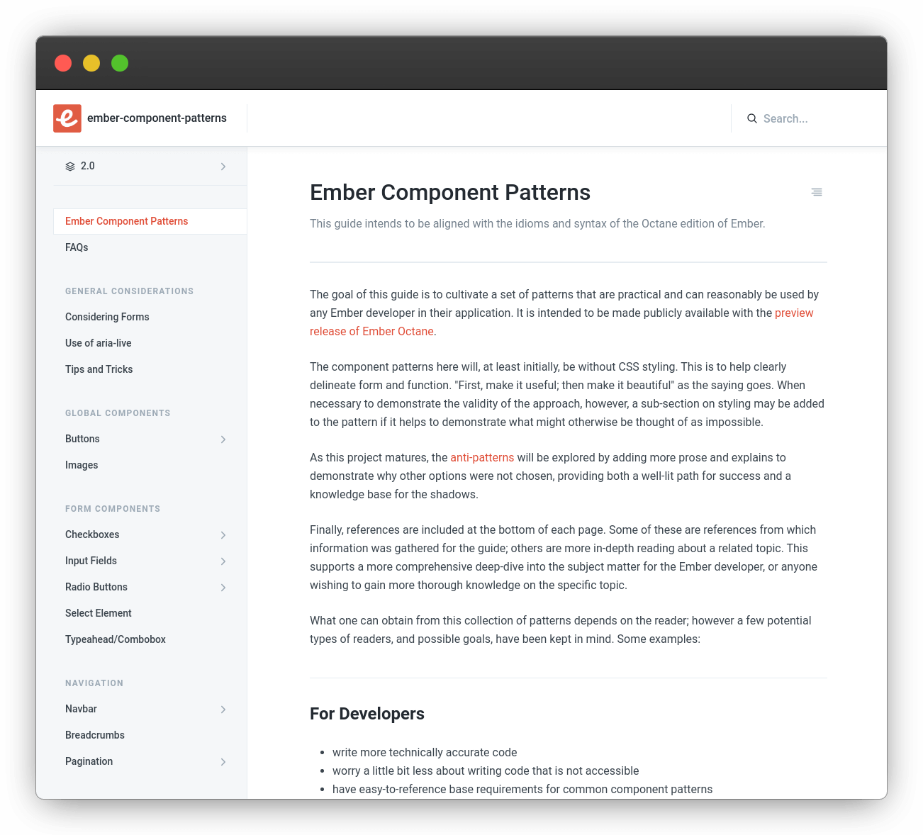
To keep this guide concise, we built a separate site for component patterns in Ember. This project also addresses anti-patterns and accessibility for components.
