In this chapter, you will add interactivity to the page, allowing the user to click an image to enlarge or shrink it:
While doing so, you will learn about:
- Adding behavior to components with classes
- Accessing instance states from templates
- Managing state with tracked properties
- Using conditionals syntaxes in templates
- Responding to user interaction with actions
- Invoking element modifiers
- Testing user interactions
Adding Behavior to Components with Classes
So far, all the components we have written are purely presentational—they are simply reusable snippets of markup. That's pretty cool! But in Ember, components can do so much more.
Sometimes, you want to associate some behavior with your components so that they can do more interesting things. For example, <LinkTo> can respond to clicks by changing the URL and navigating us to a different page.
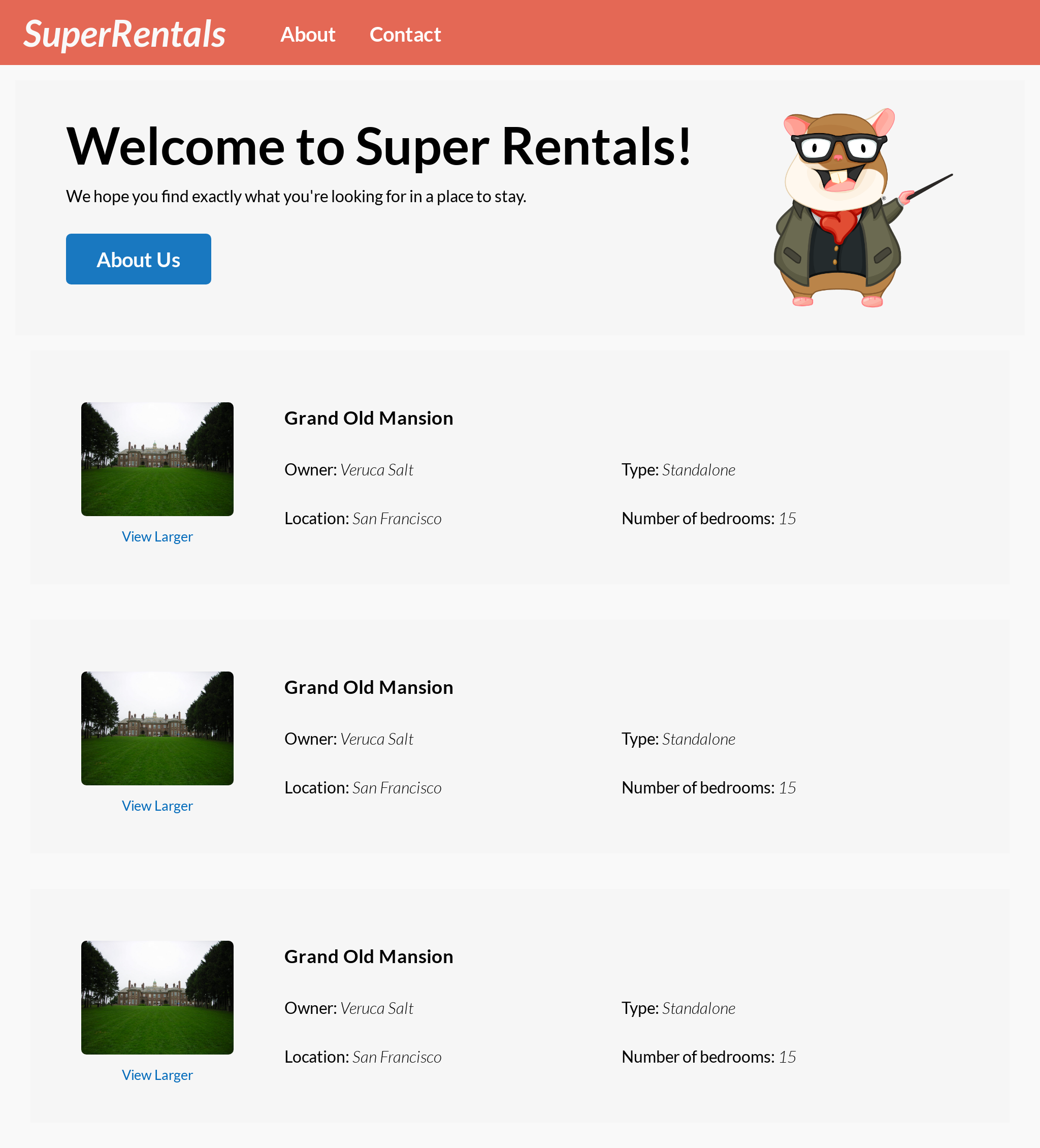
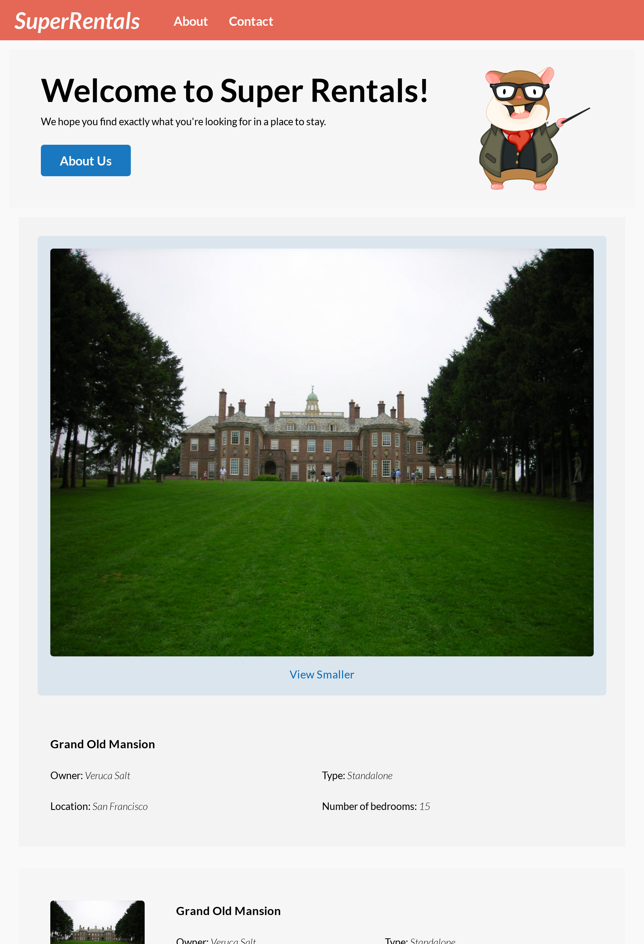
Here, we are going to do just that! We are going to implement the "View Larger" and "View Smaller" functionality, which will allow our users to click on a property's image to view a larger version, and click on it again to return to the smaller version.
In other words, we want a way to toggle the image between one of the two states. In order to do that, we need a way for the component to store two possible states, and to be aware of which state it is currently in.
Ember optionally allows us to associate JavaScript code with a component for exactly this purpose. We can add JavaScript to our <RentalImage> component by "wrapping" the component in a class definition.
<template>
  <div class="image">
    <img ...attributes />
  </div>
</template>
import Component from '@glimmer/component';

export default class RentalImage extends Component {
  <template>
    <div class="image">
      <img ...attributes />
    </div>
  </template>
}
Now our component contains a JavaScript class, inheriting from @glimmer/component. The template is now nested inside the class definition.

Ember will create an instance of the class whenever our component is invoked. We can use that instance to store our state:
import Component from '@glimmer/component';

export default class RentalImage extends Component {
  constructor(...args) {
    super(...args);
    this.isLarge = false;
  }

  <template>
    <div class="image">
      <img ...attributes />
    </div>
  </template>
}
Here, in the component's constructor, we initialized the instance variable this.isLarge with the value false, since this is the default state that we want for our component.
Accessing Instance States from Templates
Let's update our template to use this state we just added:
import Component from '@glimmer/component';

export default class RentalImage extends Component {
  constructor(...args) {
    super(...args);
    this.isLarge = false;
  }

  <template>
    <div class="image">
      <img ...attributes />
    </div>
    {{#if this.isLarge}}
      <div class="image large">
        <img ...attributes>
        <small>View Smaller</small>
      </div>
    {{else}}
      <div class="image">
        <img ...attributes>
        <small>View Larger</small>
      </div>
    {{/if}}
  </template>
}
In the component's template section, we have access to the component's JavaScript instance variables. The {{#if ...}}...{{else}}...{{/if}} conditionals syntax allows us to render different content based on a condition (in this case, the value of the instance variable this.isLarge). Combining these two features, we can render either the small or the large version of the image accordingly.
We can verify this works by temporarily changing the initial value in our JavaScript file. If we change app/components/rental/image.js to initialize this.isLarge = true; in the constructor, we should see the large version of the property image in the browser. Cool!
Once we've tested this out, we can change this.isLarge back to false.
Since this pattern of initializing instance variables in the constructor is pretty common, there happens to be a much more concise syntax for it:
import Component from '@glimmer/component';

export default class RentalImage extends Component {
  constructor(...args) {
    super(...args);
    this.isLarge = false;
  }
  isLarge = false;

  <template>
    {{#if this.isLarge}}
      <div class="image large">
        <img ...attributes>
        <small>View Smaller</small>
      </div>
    {{else}}
      <div class="image">
        <img ...attributes>
        <small>View Larger</small>
      </div>
    {{/if}}
  </template>
}
This does exactly the same thing as before, but it's much shorter and less to type!
Of course, our users cannot edit our source code, so we need a way for them to toggle the image size from the browser. Specifically, we want to toggle the value of this.isLarge whenever the user clicks on our component.
Managing State with Tracked Properties
Let's modify our class to add a method for toggling the size:
import Component from '@glimmer/component';
import { tracked } from '@glimmer/tracking';
import { action } from '@ember/object';

export default class RentalImage extends Component {
  isLarge = false;
  @tracked isLarge = false;

  @action toggleSize() {
    this.isLarge = !this.isLarge;
  }

  <template>
    {{#if this.isLarge}}
      <div class="image large">
        <img ...attributes>
        <small>View Smaller</small>
      </div>
    {{else}}
      <div class="image">
        <img ...attributes>
        <small>View Larger</small>
      </div>
    {{/if}}
  </template>
}
We did a few things here, so let's break it down.
First, we added the @tracked decorator to the isLarge instance variable. This annotation tells Ember to monitor this variable for updates. Whenever this variable's value changes, Ember will automatically re-render any templates that depend on its value.
In our case, whenever we assign a new value to this.isLarge, the @tracked annotation will cause Ember to re-evaluate the {{#if this.isLarge}} conditional in our template, and will switch between the two blocks accordingly.
Responding to User Interaction with Actions
Next, we added a toggleSize method to our class that switches this.isLarge to the opposite of its current state (false becomes true, or true becomes false).
Finally, we added the @action decorator to our method. This indicates to Ember that we intend to use this method from our template. Without this, the method will not function properly as a callback function (in this case, a click handler).
With that, it's time to wire this up in the template section:
import Component from '@glimmer/component';
import { tracked } from '@glimmer/tracking';
import { action } from '@ember/object';
import { on } from '@ember/modifier';

export default class RentalImage extends Component {
  @tracked isLarge = false;

  @action toggleSize() {
    this.isLarge = !this.isLarge;
  }

  <template>
    {{#if this.isLarge}}
      <div class="image large">
      <button type="button" class="image large" {{on "click" this.toggleSize}}>
        <img ...attributes>
        <small>View Smaller</small>
      </div>
      </button>
    {{else}}
      <div class="image">
      <button type="button" class="image" {{on "click" this.toggleSize}}>
        <img ...attributes>
        <small>View Larger</small>
      </div>
      </button>
    {{/if}}
  </template>
}
We changed two things here.
First, since we wanted to make our component interactive, we switched the containing tag from <div> to <button> (this is important for accessibility reasons). By using the correct semantic tag, we will also get focusability and keyboard interaction handling "for free".
Next, we used the {{on}} modifier to attach this.toggleSize as a click handler on the button. The {{on}} modifier is imported from the @ember/modifier package, which is part of Ember.
With that, we have created our first interactive component. Go ahead and try it in the browser!
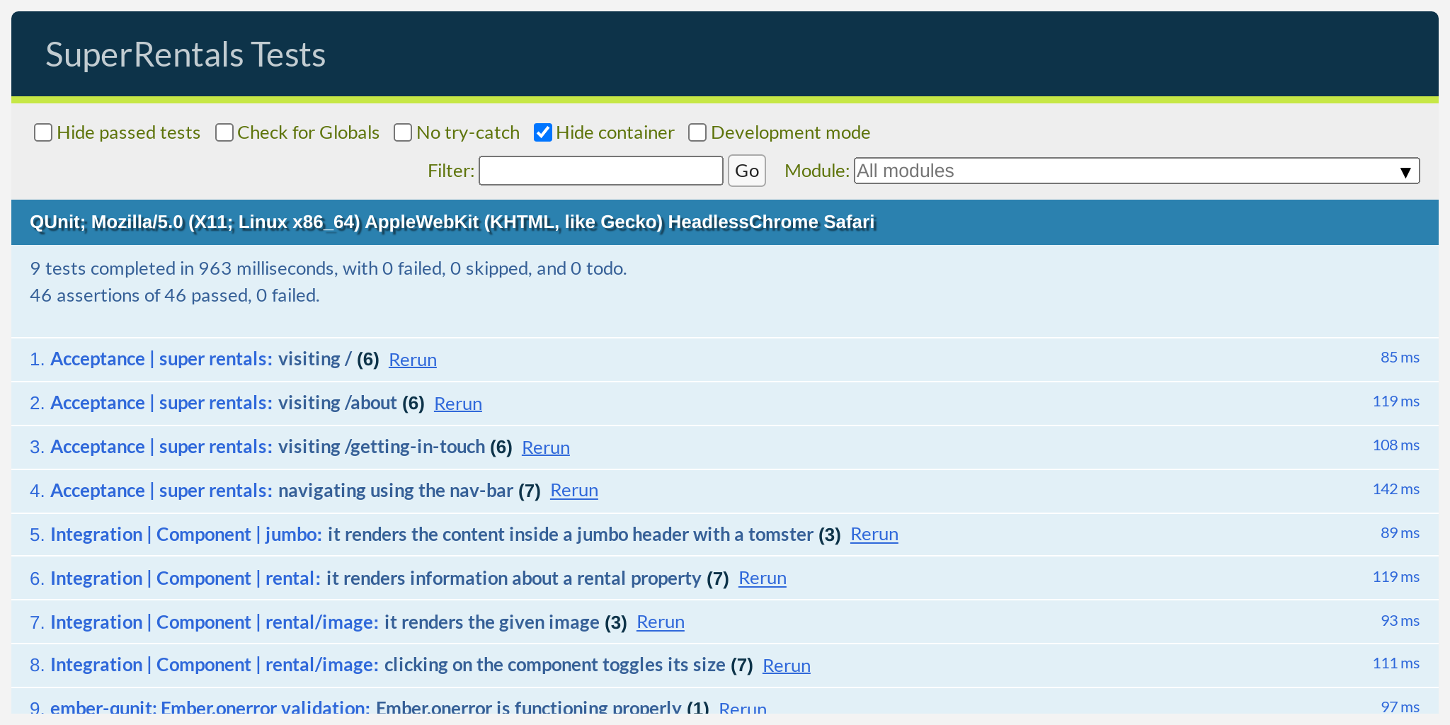
Testing User Interactions
Finally, let's write a test for this new behavior:
import { module, test } from 'qunit';
import { setupRenderingTest } from 'super-rentals/tests/helpers';
import { render } from '@ember/test-helpers';
import { render, click } from '@ember/test-helpers';
import RentalImage from 'super-rentals/components/rental/image';

module('Integration | Component | rental/image', function (hooks) {
  setupRenderingTest(hooks);

  test('it renders the given image', async function (assert) {
    await render(<template>
      <RentalImage
        src="/assets/images/teaching-tomster.png"
        alt="Teaching Tomster"
      />
    </template>);

    assert
      .dom('.image img')
      .exists()
      .hasAttribute('src', '/assets/images/teaching-tomster.png')
      .hasAttribute('alt', 'Teaching Tomster');
   });

  test('clicking on the component toggles its size', async function (assert) {
    await render(<template>
      <RentalImage
        src="/assets/images/teaching-tomster.png"
        alt="Teaching Tomster"
      />
    </template>);

    assert.dom('button.image').exists();

    assert.dom('.image').doesNotHaveClass('large');
    assert.dom('.image small').hasText('View Larger');

    await click('button.image');

    assert.dom('.image').hasClass('large');
    assert.dom('.image small').hasText('View Smaller');

    await click('button.image');

    assert.dom('.image').doesNotHaveClass('large');
    assert.dom('.image small').hasText('View Larger');
  });
});
Let's clean up our template before moving on. We introduced a lot of duplication when we added the conditional in the template. If we look closely, the only things that are different between the two blocks are:
- The presence of the
"large"CSS class on the<button>tag. - The "View Larger" and "View Smaller" text.
These changes are buried deep within the large amount of duplicated code. We can reduce the duplication by using an {{if}} expression instead:
import Component from '@glimmer/component';
import { tracked } from '@glimmer/tracking';
import { action } from '@ember/object';
import { on } from '@ember/modifier';

export default class RentalImage extends Component {
  @tracked isLarge = false;

  @action toggleSize() {
    this.isLarge = !this.isLarge;
  }

  <template>
    {{#if this.isLarge}}
      <button type="button" class="image large" {{on "click" this.toggleSize}}>
        <img ...attributes>
    <button type="button" class="image {{if this.isLarge "large"}}" {{on "click" this.toggleSize}}>
      <img ...attributes>
      {{#if this.isLarge}}
        <small>View Smaller</small>
      </button>
    {{else}}
      <button type="button" class="image" {{on "click" this.toggleSize}}>
        <img ...attributes>
      {{else}}
        <small>View Larger</small>
      </button>
    {{/if}}
      {{/if}}
    </button>
  </template>
}
The expression version of {{if}} takes two arguments. The first argument is the condition. The second argument is the expression that should be evaluated if the condition is true.
Optionally, {{if}} can take a third argument for what the expression should evaluate into if the condition is false. This means we could rewrite the button label like so:
import Component from '@glimmer/component';
import { tracked } from '@glimmer/tracking';
import { action } from '@ember/object';
import { on } from '@ember/modifier';

export default class RentalImage extends Component {
  @tracked isLarge = false;

  @action toggleSize() {
    this.isLarge = !this.isLarge;
  }

  <template>
    <button type="button" class="image {{if this.isLarge "large"}}" {{on "click" this.toggleSize}}>
      <img ...attributes>
      {{#if this.isLarge}}
        <small>View Smaller</small>
      {{else}}
        <small>View Larger</small>
      {{/if}}
      <small>View {{if this.isLarge "Smaller" "Larger"}}</small>
    </button>
  </template>
}
Whether or not this is an improvement in the clarity of our code is mostly a matter of taste. Either way, we have significantly reduced the duplication in our code, and made the important bits of logic stand out from the rest.
Run the test suite one last time to confirm our refactor didn't break anything unexpectedly, and we will be ready for the next challenge!